Yes, I try not to be judgmental of others based on appearances. If everyone judged me by MY cover, I would not have had any friends when I was between the ages of 8 and 14. Truth.
|
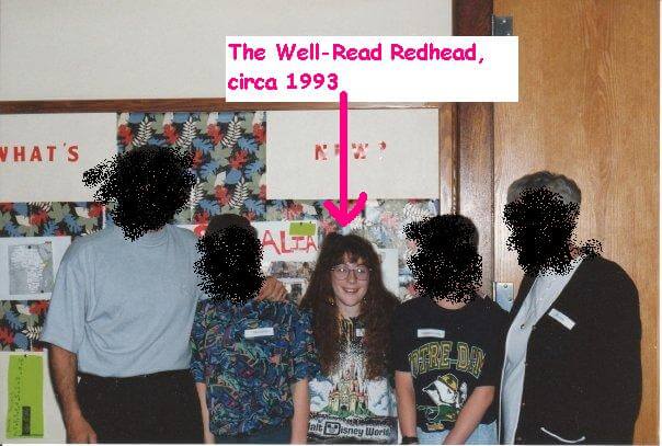
| At the age of 9, the Well-Read Redhead enjoyed perms, florescent Disney t-shirts, and coke bottle glasses. Not pictured: scoliosis back brace. Friends' faces blurred to hide their embarrassment. |
A couple months back, I read a post by Melissa at the Harley Bear Book Blog that addressed this very conundrum. Popular books that she had no desire to read, because the covers didn't strike her fancy. I feel this way ALL THE TIME. It's amazing what a bad cover can do for first impressions.
That's not to say I don't make exceptions--I do, and I'm often glad for it. My favorite example of this is The Night Circus by Erin Morgenstern. The #1 reason it took me so long to read it is because I disliked the cover--it felt cartoonish and too...magicky. And then it ended up being one of my top books of 2012. Moral of the story: exceptions are necessary, but the judging still happens.
So, what cover elements are the biggest turnoffs for me?
1. Any movie-inspired cover
Whenever a book is offered with either its original cover or its Hollywoodized version, I always go for the original. I feel like the movie covers "cheapen" the appearance, for lack of a better word. This is probably because I often think the book is 1000 times better than the movie, anyway.
2. The author's name is bigger than the title
Unfortunately, I see this trend more and more these days, and it is a serious pet peeve of mine. Big-name authors often have their name blown up bigger than the title on the front cover. I'm sure it helps with book sales (if you have a large following, some people don't care what the book's about--just that YOU wrote it), but as a reader, it annoys me. The book is about the plot, not about the author. (And yes, I know two of my faves--Stephen King and Jodi Picoult--are top offenders here.)
3. Poorly/awkwardly Photoshopped
Pertains to approximately 95% of all the self-published covers I've ever seen. I understand the design budget is smaller, but...really? There are some really well-done self-published covers too (The Thief of Auschwitz and Bluff are two of them) so you can't use that as an excuse.
4. Too intricate
If there's too many details on a cover, it turns me off. I want to take one quick look and get some idea of where the book is going, or a mystery that might be revealed. I don't want to have to pull out my magnifying glass to figure it out.
5. Too cutesy
Even if it's YA, I don't necessarily want to feel like I'm reading an after school special.
So readers, what cover elements do YOU shy away from? And please feel free to share awkward photos of your younger selves.


Haha, I am definitely a cover snob, too. I usually avoid the cutesy covers and really cannot understand the fascination with girls in big dresses. I don't know that I ever read those books just because I can't get past how silly they look! I definitely lean towards more simple covers without people on them.
ReplyI hardly notice cover art anymore because I read almost exclusively on my kindle. I'll go to find a cover image to blog with and I'm like... Really? They went there? That said, the cutesy and/or movie covers are HUGE turnoffs. I will probably never read those Anna/Lola books because those covers are just... No.
Replydonttake, yes, I actually used to love the "girls in big dresses" phenomenon (a la The Luxe series), but then it got used too much, now it's just tired.
ReplyKatie, good point, there are probably a lot of Kindle books I'm reading that have terrible covers, and I would never know...you've won this round, e-books.
Love your examples! Even though I'm a HUGE Anna fan, I agree - the cover could have been WAY better.
ReplyAnd I totally do not like movie-adaptations as the book cover. This was a BOOK first. I won't buy a book with the movie on the cover! I want the original one. Haha.
Fantabulous post! I actually do most of my reading on my Nook and while I can access the cover with a click, it's not the same as seeing the image constantly on your bedside table or sitting in a stack somewhere.
ReplyAnd even though I'm obsessed with books bound for the big screen I tend to prefer the original as well. The idea of pandering to an audience, slapping some star on the front does seem an affront to the poor writer. On the other hand there are some of those I quite like - I'm thinking the cover of The Descendants which rather stylishly featured gorgeous George Clooney. http://chapter1-take1.blogspot.com/2011/11/george-clooney-is-king-in-descendants.html
I've never even thought of this! Haha! But thinking back to books I've put down before and reasons being the cover it was bc it looked too much set in history or like a history book. Can't read the title because of the font or the tile is just too weird for me to get behind the book. Books that look to "dark" of a storyline. Hmmmm...and books that just too plain (so maybe the storyline too plain). One thing unfortunately that makes me out a book down is the size and thickness of a book. I get worried and normally put back (nothing to do with cover though). Ebooks help with this since I can't see the thickness.
ReplyNice to see the picture, I had a scoliosis back brace too and hated it.
ReplyI agree with what you say about covers, although there are some movie covers I like more than the original, e.g. The hunger games, I like the sign of the Mockingjay.
One of the main reasons I don't read self published books is because of their covers, which are often not well done indeed.
Nice post!
I too, sadly, am a cover snob. The cover of The Help comes to mind. It didn't seem to fit, but was an amazing read. And I enjoyed perms myself, and wore glasses. I didn't have scoliosis, but a chipped front tooth!
ReplySim, yes, that's exactly it! I feel like it does an injustice to the author, who was the original creator after all. (Though Clooney does make everything better.)
ReplyAngela, that's so true--that cover really doesn't fit with the book. Sorry about the tooth! :)
I was the opposite with The Night Circus. The cover made me want to read it, then everyone raved about it, then I was so disappointed! I quite like intricate covers too. Although I agree with you on how off-putting a bad cover design is.
ReplyI totally agree with all of these -- except the one about intricate covers. I like being able to kind of search for clues or try to figure out what the significance of details are. But I really really dislike movie tie-in cover -- they totally say 'I have no actual taste for books, and I'm only reading this because it was made into a blockbuster movie.' Cutesy is also a total turn-off for me.
ReplyI love this topic! I definitely judge books by their covers, too. I hate movie-tie in edition covers, and never buy them. I don't like the cover trend, especially in historical fiction, that features women with their heads cropped off. This one is pretty hard to get away from in historical fiction though, so I have tons of books with headless women on my shelves. I'm not a big fan of cutesy either, and I don't like the covers of regular fiction (as opposed to romance novels) that try to be too sexy. I also read a lot of fantasy, but can't stand a lot of the covers on fantasy novels -- when I'm perusing the shelves at my local book store I find that any fantasy novel I pick up that features strange creatures on the cover usually gets put right back down again.
ReplyIt's so funny that I had the opposite reaction to the Night Circus! I thought the cover was beautiful, but I disliked the story (very weak plot in my opinion; I'm not a fan of "atmosphere only" books). Beauty is in the eye of the beholder!
ReplyVery true! I love hearing about how other people view this. Everyone has their own distinct preferences...
ReplyOh man, the 90s. Wow. I am so not comfortable enough to put any of my photos from then on the internet. I'd rather throw them all in a fire.
ReplyThere are some movie tie-ins I like a lot though, with A Room with a View and Never Let Me Go being the prime examples. With a A Room with a View, I just really think the movie captured it perfectly and they picked a great shot. With Never Let Me Go, the original cover of it is a baby's face, so it's pretty much one of the scariest covers ever for me. I'll take pretty much any cover over a baby cover.
I HATE when the author's name or, even worse, the series name, is larger than the book's title. Generally the large author name is when all of their books are pretty much the same. *coughs*
I am not with you on the intricate covers. Both of those are AWESOME. I think those are among my personal favorites actually.
Cutesy can go either way.
I shy away from almost any book with a dude on the cover, especially if they're shirtless. Even though I find men attractive, they almost always look creepy on book covers, maybe because they're fighting fires or fighting gun battles without freaking shirts.
Oh, I also hate kissing covers and angel wing covers.
YAY, I was hoping you would weight in Christina (cuz I do looove your cover snark). I lol'd at your comment about shirtless dudes. So true. And angel wings...especially badly drawn/Photoshopped ones. Sigh.
ReplyAlso, I will agree with you about Never Let You Go. I like the original cover, but the movie one doesn't scream Hollywood like so many of the other ones.
Make out or about to make out covers, especially on YA books, make me uncomfortable, as do shirtless men/heaving bososms. And anything fantasy/sci-fi with women in improbably sexy fight poses.
ReplyYES to the sexy fight poses, those are just bad.
ReplyCount me in, Kelly - and by the way, I LOVE this post!
ReplyI don't mind intricate covers, though. I quite like them sometimes, though they don't rank high for me. I like them best when they're stylised with just two colours, for example. I held off on reading Anna and the French Kiss for so long because the cover was so cutesy - really doesn't do the book justice at all!
And oh! That Ann Aguirre cover, the model looks so awkward, like someone broke her neck or something. Terrible design. Totally with you on the movie covers thing, though aside from the added cheese factor, I hate having anyone think I got the book because of the movie. Even if that's true (which is rare), it makes me feel like someone who's going with the herd, and I hate that.