Everyone always says "don't judge a book by its cover." Which I think is great advice...for everything except books.
Yes, I try not to be judgmental of others based on appearances. If everyone judged me by MY cover, I would not have had any friends when I was between the ages of 8 and 14. Truth.

|
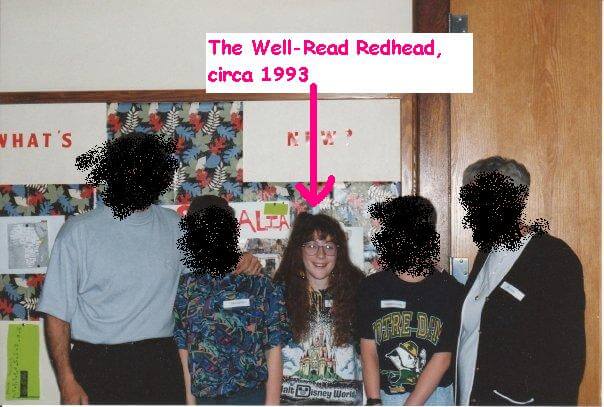
At the age of 9, the Well-Read Redhead enjoyed perms, florescent Disney t-shirts, and coke bottle glasses. Not pictured: scoliosis back brace.
Friends' faces blurred to hide their embarrassment. |
But throw an unappealing book cover in front of me, and unless someone can make a pretty strong case for it, you can bet I'm picking up something else to read.
A couple months back, I read
a post by Melissa at the Harley Bear Book Blog that addressed this very conundrum. Popular books that she had no desire to read, because the covers didn't strike her fancy. I feel this way ALL THE TIME. It's amazing what a bad cover can do for first impressions.
That's not to say I don't make exceptions--I do, and I'm often glad for it. My favorite example of this is
The Night Circus by Erin Morgenstern. The #1 reason it took me so long to read it is because I disliked the cover--it felt cartoonish and too...magicky. And then it ended up being one of
my top books of 2012. Moral of the story: exceptions are necessary, but the judging still happens.
So, what cover elements are the biggest turnoffs for me?
1. Any movie-inspired cover
Whenever a book is offered with either its original cover or its Hollywoodized version, I always go for the original. I feel like the movie covers "cheapen" the appearance, for lack of a better word. This is probably because I often think the book is 1000 times better than the movie, anyway.
2. The author's name is bigger than the title
Unfortunately, I see this trend more and more these days, and it is a serious pet peeve of mine. Big-name authors often have their name blown up bigger than the title on the front cover. I'm sure it helps with book sales (if you have a large following, some people don't care what the book's about--just that YOU wrote it), but as a reader, it annoys me. The book is about the plot, not about the author. (And yes, I know two of my faves--Stephen King and Jodi Picoult--are top offenders here.)
3. Poorly/awkwardly Photoshopped
Pertains to approximately 95% of all the self-published covers I've ever seen. I understand the design budget is smaller, but...really? There are some really well-done self-published covers too (
The Thief of Auschwitz and
Bluff are two of them) so you can't use that as an excuse.
4. Too intricate
If there's too many details on a cover, it turns me off. I want to take one quick look and get some idea of where the book is going, or a mystery that might be revealed. I don't want to have to pull out my magnifying glass to figure it out.
5. Too cutesy
Even if it's YA, I don't necessarily want to feel like I'm reading an after school special.
So readers, what cover elements do YOU shy away from? And please feel free to share awkward photos of your younger selves.